| Counties | Mean Rate | Median Rate | Standard Deviation | Minimum Rate | Maximum Rate | Mean Population | Total Cases |
|---|---|---|---|---|---|---|---|
| 439 | 18.07 | 14.1 | 15.99 | 0 | 103.8 | 125187.9 | 11122 |
Spatial Point Process Analysis: Primary and Secondary Syphilis in the Southeast United States
Spatial autocorrelation analysis and residual mapping for syphilis case rates in the Southeast United States
Keywords
sexually transmitted infections, STI, STD, syphilis, epidemiology, public health, Southeast United States, surveillance, trends
Overview
This analysis examines the spatial distribution of Primary and Secondary Syphilis cases in 2023 across Southeast US counties using spatial point process methods. The analysis tests whether the spatial distribution is solely related to population size, or if there are additional spatial patterns (spatial autocorrelation) that cannot be explained by population alone. It is important to understand how space impacts the spread of STIs as this provides insights into potential sexual networks and connected transmission patterns.
For detailed information about the spatial analysis methodologies, including Local Indicators of Spatial Association (LISA) and spatial point process analysis, see the Methods page.
Summary Statistics
To gain better intuition about the distribution of syphilis case rates, we can look at the summary statistics across all counties for 2023.
Here we find that the mean case rates is around 18 per 100,000 population, with a median of 14.1, but the standard devition is nearly 16 meaning that there is a lot of variation in the case rates across the counties. These summary statistics do not tell us about how these rates may be related in space (e.g., are counties that are close to one another share similar case rates, even when accounting for population size?). To do this, we need to conduct a spatial autocorrelation analysis.
Spatial Autocorrelation
The spatial autocorrelation analysis is conducted using the Local Indicators of Spatial Association (LISA) method along with Moran’s I. The LISA method is a spatial statistical technique that measures the degree of clustering of a variable in a geographic space. Moran’s I is a global measure of spatial autocorrelation that measures the degree of clustering of a variable in a geographic space.
For detailed methodology, see the LISA methods section.
Global Moran’s I
The Global Moran’s I statistic measures spatial autocorrelation:
- I > 0: Positive spatial autocorrelation (similar values cluster in space together)
- I < 0: Negative spatial autocorrelation (dissimilar values cluster in space together)
- I ≈ 0: No spatial autocorrelation (random spatial distribution in space)
| Mean LISA I | Number of Significant Counties | Number of High-High Clusters | Number of Low-Low Clusters | Number of High-Low Clusters | Number of Low-High Clusters |
|---|---|---|---|---|---|
| 0.2414 | 73 | 42 | 13 | 8 | 10 |
Here we that the the LISA I is around 0.24, which is positive indicating that there is positive spatial autocorrelation. This means that counties that are close to one another tend to have similar case rates, even when accounting for population size. We can also see that there are several distinct clusters of counties with similar case rates.
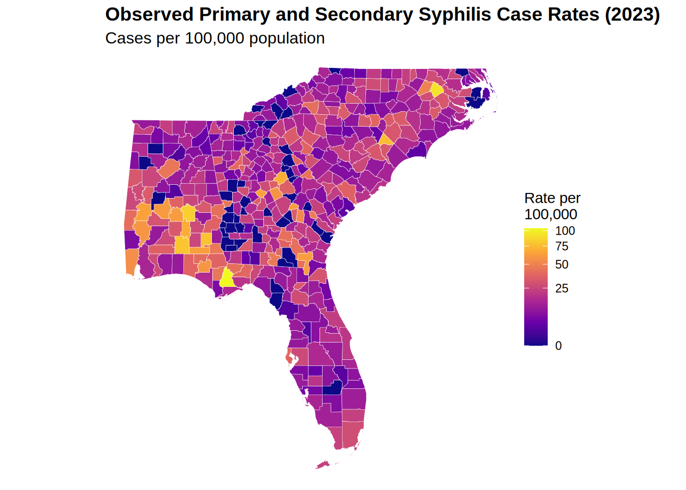
Observed Case Rates
The observed case rates are mapped to show the spatial distribution of primary and secondary syphilis cases in the Southeast United States. This map shows the raw case rates per 100,000 population. These are the observed cases before any modeling is done.
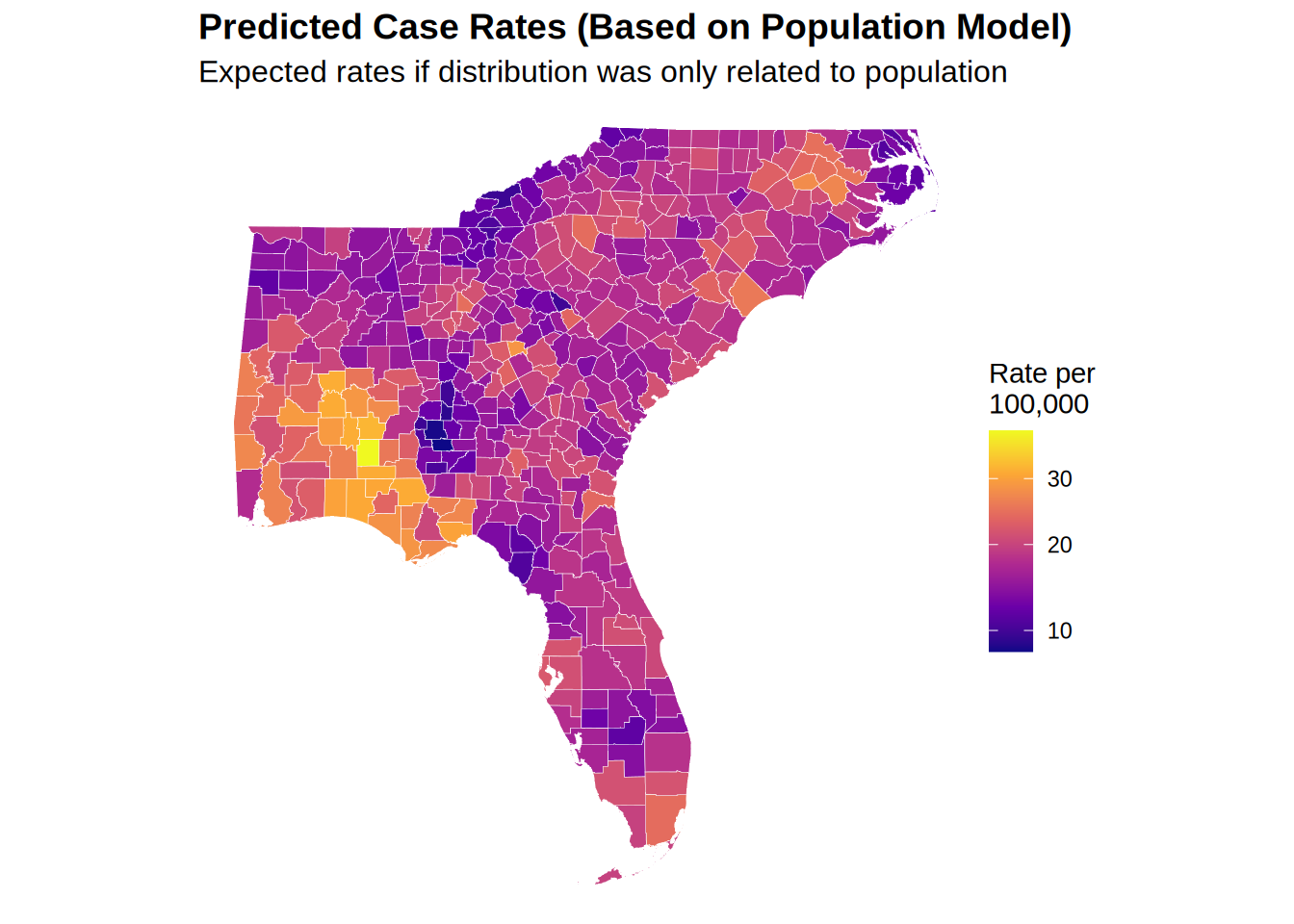
Predicted Case Rates
Now using the spatial regression model, we can predict the case rates based on population and location. These estimates represent the expected case rate based on the model.
Residuals: Observed - Predicted
The residuals represent the difference between the actual reported case rates and the modelled rates and show where counties are surplus cases (positive residuals, higher than expected from the model) or lower than expected cases (negative residuals, lower than expected) relative to what would be predicted based on population alone.
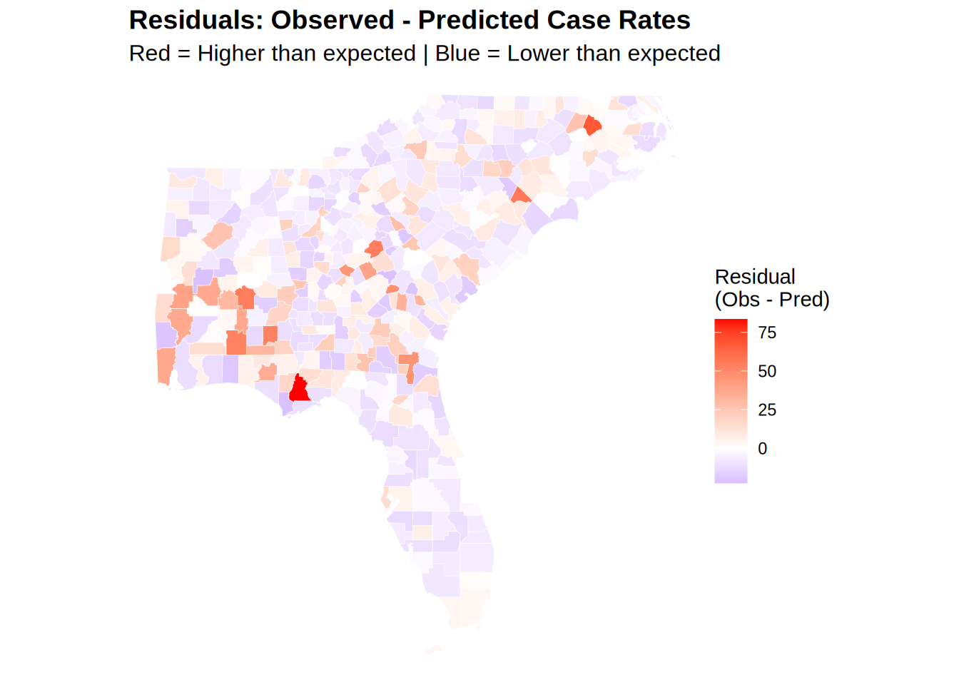
| Mean Residual | Median Residual | Standard Deviation | Number of Counties with Positive Residuals | Number of Counties with Negative Residuals |
|---|---|---|---|---|
| 0 | -3.55 | 14.66 | 175 | 264 |
We can use this map to rapidly identify that there are several counties with surplus cases (red) and several counties with lower than expected cases (blue).
The differences between the observed and predicted case rates (e.g., surplus or lower than expected cases), could be due to a number of factors not limited to:
- Sucessful prevention programs which better identify and treat cases.
- Under-reporting of cases (which could be due to lack of testing, under reporting, or other challenges in the reporting process).
- Successful outbreak response programs which help identify and treat cases in a specific area.
- Changes in the population due to migration or other factors.
It is important to note that in all of these models, we are only accounting for space and population–we not account for other factors that may be related to the spread of syphilis, such as sexual behavior, substance use, or other factors. Implicitly, we capture these effects through space, but it is important to note that this is a simplification and that the real world is more complex.
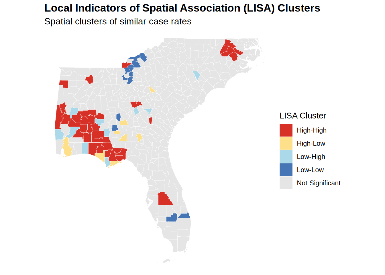
Local Indicators of Spatial Association (LISA) Clusters
LISA identifies clusters of similar values in the data. This is a local measure of spatial autocorrelation that measures the degree of clustering of a variable in a geographic space, in our case the county case rates of syphilis.
For detailed methodology, see the LISA methods section.
- High-High: High-rate counties surrounded by high-rate counties
-
Low-Low: Low-rate counties surrounded by low-rate counties
- High-Low: High-rate counties surrounded by low-rate counties (outliers)
- Low-High: Low-rate counties surrounded by high-rate counties (outliers)
| lisa_cluster | n |
|---|---|
| Not Significant | 366 |
| High-High | 42 |
| Low-Low | 13 |
| Low-High | 10 |
| High-Low | 8 |
Local Indicators of Spatial Association (LISA) Clusters for Primary and Secondary Syphilis in the Southeast United States (2023)
We can quickly see that there are several clusters of cases with similar rates, especially across Alabama and Eastern North Carolina, with other more sporadic clusters across the rest of the region.
Counties with Largest Residuals
This table shows the top 20 counties with the highest absolute difference between the observed and predicted case rates. This is a measure of how much the observed case rates deviate from the predicted case rates. A conunty may have fewer cases than expeected based on the population due to under-reporting or successful prevention programs.
| County | FIPS | Cases | Population | Observed Rate | Predicted Rate | Residual |
|---|---|---|---|---|---|---|
| Liberty County, Florida | 12077 | 8 | 7706 | 103.8 | 20.32 | 83.48 |
| Edgecombe County, North Carolina | 37065 | 45 | 48832 | 92.2 | 24.74 | 67.46 |
| Dillon County, South Carolina | 45033 | 21 | 27698 | 75.8 | 19.01 | 56.79 |
| Hancock County, Georgia | 13141 | 6 | 8676 | 69.2 | 14.26 | 54.94 |
| Montgomery County, Alabama | 01101 | 188 | 224980 | 83.6 | 28.87 | 54.73 |
| Dale County, Alabama | 01045 | 39 | 49871 | 78.2 | 25.54 | 52.66 |
| Covington County, Alabama | 01039 | 30 | 37952 | 79.0 | 26.38 | 52.62 |
| Treutlen County, Georgia | 13283 | 4 | 6341 | 63.1 | 15.92 | 47.18 |
| Charlton County, Georgia | 13049 | 8 | 12934 | 61.9 | 15.77 | 46.13 |
| Bibb County, Georgia | 13021 | 101 | 156512 | 64.5 | 19.40 | 45.10 |
| Wilkinson County, Georgia | 13319 | 5 | 8725 | 57.3 | 17.14 | 40.16 |
| Marengo County, Alabama | 01091 | 12 | 18684 | 64.2 | 24.09 | 40.11 |
| Mobile County, Alabama | 01097 | 227 | 411640 | 55.1 | 17.61 | 37.49 |
| Crenshaw County, Alabama | 01041 | 9 | 13101 | 68.7 | 31.26 | 37.44 |
| Clarke County, Alabama | 01025 | 13 | 22337 | 58.2 | 21.30 | 36.90 |
| Dallas County, Alabama | 01047 | 22 | 36165 | 60.8 | 24.07 | 36.73 |
| Washington County, Florida | 12133 | 15 | 25602 | 58.6 | 23.71 | 34.89 |
| Toombs County, Georgia | 13279 | 14 | 27040 | 51.8 | 18.64 | 33.16 |
| Evans County, Georgia | 13109 | 5 | 10754 | 46.5 | 13.97 | 32.53 |
| Geneva County, Alabama | 01061 | 17 | 26988 | 63.0 | 31.04 | 31.96 |
This table shows the top 20 counties with the lowest absolute difference between the observed and predicted case rates. This is a measure of how much the observed case rates deviate from the predicted case rates. A conunty may have more cases than expected based on the population due to under-reporting or successful prevention programs.
| County | FIPS | Cases | Population | Observed Rate | Predicted Rate | Residual |
|---|---|---|---|---|---|---|
| Perry County, Alabama | 01105 | 0 | 7738 | 0.0 | 22.60 | -22.60 |
| Gulf County, Florida | 12045 | 1 | 15693 | 6.4 | 28.67 | -22.27 |
| Johnson County, Georgia | 13167 | 0 | 9282 | 0.0 | 22.19 | -22.19 |
| Washington County, Alabama | 01129 | 1 | 15022 | 6.7 | 27.22 | -20.52 |
| Candler County, Georgia | 13043 | 0 | 11059 | 0.0 | 20.30 | -20.30 |
| Okaloosa County, Florida | 12091 | 23 | 218464 | 10.5 | 30.20 | -19.70 |
| Columbia County, Georgia | 13073 | 7 | 165162 | 4.2 | 23.65 | -19.45 |
| Marlboro County, South Carolina | 45069 | 1 | 25704 | 3.9 | 23.17 | -19.27 |
| Wheeler County, Georgia | 13309 | 0 | 7081 | 0.0 | 18.80 | -18.80 |
| Glascock County, Georgia | 13125 | 0 | 2954 | 0.0 | 18.46 | -18.46 |
| Beaufort County, South Carolina | 45013 | 6 | 198979 | 3.0 | 21.43 | -18.43 |
| Thomas County, Georgia | 13275 | 1 | 45649 | 2.2 | 20.49 | -18.29 |
| Chilton County, Alabama | 01021 | 1 | 46431 | 2.2 | 20.21 | -18.01 |
| Nassau County, Florida | 12089 | 6 | 101501 | 5.9 | 23.86 | -17.96 |
| Chattahoochee County, Georgia | 13053 | 0 | 8661 | 0.0 | 17.84 | -17.84 |
| Elbert County, Georgia | 13105 | 0 | 20013 | 0.0 | 17.70 | -17.70 |
| Harris County, Georgia | 13145 | 0 | 36654 | 0.0 | 17.60 | -17.60 |
| Bullock County, Alabama | 01011 | 1 | 9897 | 10.1 | 27.56 | -17.46 |
| Grady County, Georgia | 13131 | 1 | 26066 | 3.8 | 21.19 | -17.39 |
| Clinch County, Georgia | 13065 | 0 | 6746 | 0.0 | 17.36 | -17.36 |
Ultimately, these kinds of spatial analysis can help us understand how geography plays a role in the spread of STIs and where resources or different strategies may be needed most.